Notebook

The Power of the Doodle


With my new found spirit to be a little more regular with this blog, will come a little more willingness to be that much more transparent with you readers. One of the ways that I can do that, is to be honest about some of my insecurities as a designer, and the ways in which I hope to improve.

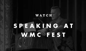
My recent showing at WMC Fest was a quick, but enjoyable one. There were so many extremely talented designers, whose work I could drool over. As many designers do, I found myself wishing more projects like that came through, allowing me to be a little more free and experimental with my design. In band merchandise, I often care way more about the band’s needs and aesthetic, than forcing my own agenda on to the piece. This is an attribute that I believe is imperative to be able to sustain your occupation over time. However, a life without doing work that expresses your unique aesthetic gets quite mundane and creatively taxing over time. There has to be a good balance of both.

Phone Call Doodles. We have to be more willing to doodle. There are several ways I can go into doodling, and how effective it is. When I think of doodling, I first think of being on a long phone call, with the pad and pen you were ready to take notes with. You realize you had one tiny thing to write down, and the rest of the page will be filled with doodles. Whether you write the name of the person you’re on the phone with in a ton of different styles, there is something to be said about the natural doodles you create with less than half of your concentration.


Don’t Be Limited By Fonts and Software. In the same spirit, it’s important to do this with your projects, when time allows. I often find that part of my job is about working quickly, and managing my time accordingly. Because most of the time, every band needs stuff all at the same time, and it comes firing in at me. I have to do my best to do good work, and do good work quickly. But when I get time, I try to make sure I get the sketchbook out to be able to freely try certain compositions out, without the limitations of the computer. This concept is an obvious one, and most designers are aware that a big portion of their work should be done off the computer.


The Pen is Mightier Than The Pen Tool. Another way I’ve found myself doodling over the years is with type styles. The rise of the popularity of hand-drawn styles has many of us designers stepping back from our font collection, and going back to pen and paper. Since I’ve been doing this, I’ve found that I’ve been creating more end-product pieces, as opposed to sketches that I will improve on in Illustrator. The lines that I am drawing will be the lines on the final piece. I’ve been getting more and more excited about continuing to do this type of work. I’m realizing that the way I’m writing each of these letters are much freer than any attempt at moving anchor points in Illustrator. These doodles are becoming superior to my fonts. There is more heart and soul in this stuff than the perfection of even the greatest fonts. Some good examples are some of the recent lyrics tees I did for the band, Train. I also did a dribbble post about the project.

One of the greatest experiences I’m having doing hand-drawn type styles is how many times I will draw the same logotype, over and over again. I find myself doing one after another, changing something tiny each time. Or, just writing it over and over again, until one just stands out. I’ve found so much freedom and satisfaction from the ability to create a completely unique typeface with each attempt.


Work For Yourself …… Sometimes. Every once in a while, we have to be able to “doodle” with our own work. What I mean is to design the stuff that results when you just want to “mess around” with your work. Sometimes there is no client, yet, but a really good idea. So you find yourself getting in and designing a poster for no one. Or a album cover for a made-up band. There’s no other opinion to think about here, just you doing what you enjoy doing.

In my opinion, some of my favorite designers’ work seems to come from this place. They’re designing in realms where the client’s strict needs aren’t present, and they have this freedom to do whatever they feel. The drawback, however, is that many of these designers can get pigeonholed into one aesthetic. But, they’re staying happy creating what they really love to create.

I’m hoping to doodle a little more. I’m hoping to get back to whatever natural aesthetic my brain comes up with. I’m excited about what may be the result.

WMC 2011

WMC 2011
The second annual WMC Fest is going on right now. I spent the day in the gallery, with some of my work hanging behind me. It’ll still be going on tomorrow, but I had to head back home for some family obligations.

The lineup of artists got a little bit beefed up this year, and I was excited to get to say hello to a couple of designers. My man Pants Sechrist was there, and I thoroughly enjoyed our chats. I feel like him and I could probably go on and on for hours, but in crowd of people, it’s a little tough.

Also got to meet Oliver Barrett, another designer from Cleveland. It’s nice to be able to talk a little basketball, even in art circles. So thanks to Pants and Oliver, the resident Clevelanders.

Standing across from me was Ft. Wayne designer, Nate Utesch. Who, after talking for a bit, realized we knew some of the same people.  Nate’s doing some great work, as well as curating Ferocious Quarterly, a publication that collects a ton of great work. I picked up a few books right away.

I was also honored to be able to finally shake Aaron Draplin‘s hand. Draplin probably sits among my top 5 favorite designers, and the dude’s good heart just makes any chat, no matter how short, quite enjoyable and refreshing. Got my hands an Ohio poster, designed by Draplin — drawing attention to our wonderful state.

Good bunch, these WMC dudes. On the 2 hour drive back down to Columbus, it got me thinking about what a great event it really is, and what the potential for this whole deal is for the future. Reminds me of an underground version of the popular TED conferences.

It also got me thinking about what I have to do to make my site more interesting. Draplin posts every day, guaranteed. Sometimes about nothing at all. But the fact that he pops in everyday makes his site feel like something is happening, all of the time, and that you want to check up on it.

I’m going to start trying a little bit harder on building a brand around myself, and doing something with this big opinion of mine. I’ve got so much to say, but so much that I’ve held back from this site, not wanting to strike any nerves.
But heck with it. I’m a good guy, with a lot of opinions. I’m gonna try and be a little more vocal.

Love Wins

Love Wins
Very quickly am I finding myself breaking my first rule of this blog – don’t discuss beliefs, and don’t get controversial. However, one of my favorite authors, Rob Bell, has given me an overwhelming need to express a tiny piece of opinion.

I love this book. I love it for so many reasons. Like many of Rob Bell’s books, I find myself reading while an enormous weight continues to lift off of my shoulders. “I am not the only one that feels this way, and I’m not losing my mind!” See, the American Christian life is a frustrating one, especially for relatively free-thinkers. My general view of Christianity has been, for some time, that I do believe in a God, but whatever the American church has turned Him into, is so far from what makes sense to me. In many cases, “Christian” is just an extension of what our society has deemed acceptable and admirable. Jesus, in the way that I understand him, would not be welcomed into the majority of America’s churches. He’s nothing like them.

So, the need to post about Rob Bell’s book, entitled Love Wins, is my simple offering to the numerous people who, like me, can understand “love”, but cannot understand the American church. To many Christians across the country, this book was called “controversial.” To me, this book simply echoes the feelings of myself, and so many others that I know. I honestly feel that if you are among the people horribly offended by Rob Bell’s book, then you simply do not have your finger on the pulse of the opinions of our people. There are so many of us that feel this way, and we’ve been overlooked. Finally there is a popular book that echoes the same sentiment that we’ve had for so long.

I care about loving people. I don’t care about being part of the club.

If you’re interested, check out Love Wins.

Super Duper

Super * Logos
I posted a shot of this on Dribbble yesterday, and have received some great feedback. It’s for a small project, for a 70s-style raglan/baseball tee. Feel free to hop over to Dribbble to join the discussion.

I find myself with Illustrator artboards like this quite frequently. It’s a funny process. Basically, I’m trying to capture that perfect vibe for a logotype, and keep failing. I do one, think that it’s okay, but try another. I think that’s just okay, then do another, and another, and so on. Before long, I’m looking at a screen full of logotypes that have all nearly captured the vibe of what I wanted. Some may have even captured the exact vibe I was hoping for. Of course, that’s not discovered until I walk away from my desk for a while, and come back and look at them all with new eyes.

This is probably my single favorite thing about what I do. The times when I sit and tinker with letters, finely tuning things, until I see what I was hoping for. It’s much like practicing your signature on a piece of paper, you keep writing it over and over until you find one you like. Anyway, thought this could be an interesting post. Thanks for reading!

Letterpress


I could watch this type of stuff all day. Check out Naomie Ross’s video, Letterpress.

To Inform And Delight


If you’re a graphic designer, and unfamiliar with Milton Glaser, then you should do what you can to learn about Milton Glaser.

Milton’s most iconic piece is probably the I Heart NY icon, for which he didn’t get paid a dime. My favorite, among many others, is his Dylan poster.

I watched the documentary Milton Glaser: To Inform and Delight last night. I’m a sucker for these types of documentaries. In graphic design, there are very few films that we can watch about our craft, so when the chance comes up to watch other people talk about what we do everyday, well – I love to indulge. (by the way, AppleTV with Netflix is life-changing.)

Now I normally hate to hear people over-talk design. I’d rather them just get to work. But Milton is one of the few designers who I believe have the wisdom and career to know what they’re talking about. If you’re gonna listen to anyone go on and on about god-knows-what, this is your guy. Check it out.

Follow up
I was thinking about Milton Glaser a lot, as I continued thinking about the film. While I respect the amount of work the man has done, I can’t help thinking – Is Milton Glaser the reason the 70s and 80s we’re so corny? Is he solely responsible for some of the design of that era that makes us cringe today? I feel like his style sits around in brass frames, getting bleached by the son, making you realize that the dentist’s office you’re sitting in is horribly outdated. It’s a matter of taste, for sure, but I cannot help but to feel like his style may be everything that I hate about that era? Or is our work of today going to be hated by designers of the future? Why do we love the design work of the fifties, but then stark to gag when we start moving into the popular art of the 70s and 80s? Was Milton Glaser the end of nostalgic, timeless design?

I’d love to hear your thoughts. Please comment.

Sketching Cat

So with this new site and blog, I’ve been racking my brain about what I’d like to post. I do want to keep the posts on this blog very frequent. My favorite blogs are those that have very frequent posts, which keep me coming back. I’ll attempt to do the same here.

Final Shirt Graphic
I worked on shirt graphics for Cat Stevens this past Thursday. The Fillmore poster style was noted as an aesthetic. I always find that I go about doing this Fillmore style in different ways each time it comes up. Sometimes it’s about only drawing the basic shape that the letter sits in, and adding interior lines to define the letter. This is the basic idea behind the popular Mojo font, and the fonts similar to it.

I’d prefer to not use an existing font, for a couple reasons. First, the font is recognizable, and looks less organic. Second, moving these fonts into the shape that you want is more trouble than what it’s worth. There’s been so many times I’ve been moving things around for an hour in Illustrator, when I realize I could have just sketched something original, and had it traced by now. Working in merch, with tight deadlines, I’ve learned to not waste time.

Instead, I simply sketched the letters on paper. This way, each letter could have it’s own identity. The drawback, is that sometimes you can just fail at this altogether. I think the key is to keep the pencil moving, and allowing lines to move through the whole piece. The top of a T could also line up with the middle of an E. Allow every letter to relate to the others.

Initial Sketch
Next, scan it in. I use Image Capture for my scans now, as opposed to Photoshop plug-ins that I’ve used before. I take the image straight into Illustrator. I put the image, at a 40% opacity, on the top layer. I then use the Pen tool, with No Fill and a Red Stroke, and get to outlining the layers.

As many have probably learned, the key to the Pen tool is to limit the number of points. The more points you have, the more jagged your lines could be. The bezier can create beautiful curves, so let it do it’s thing. Keep re-doing each line until you get it right.

Traced
I purchased the Wacom Cintiq 12WX a few months ago, and I love it. This type of project is one of the many things it’s perfect for. Using a pen, as opposed to clicking a mouse, allows me to connect a little more with each shape. I may do a full review of the Cintiq later on.

So now I add a fill, and remove the stroke. I may use the Warp tool a bit, here and there, to fix tiny imperfections. Then I am left with my final vector.

Final Vector
Now I bring the logo into Photoshop. After getting all of the lines and corners perfect, I’m going to smooth out all of the details I worked so hard on! I usually put the white logo on a black background, merge the layers, Gaussian Blur it, crank the contrast, select the white with the Magic Wand, and fill it again on a new later. This time, I split it into two colors. I usually try to keep the number of colors down, as the majority of my work is for shirt graphics, and each color costs someone more money. I add Layer Masks to the shapes, put a little texture in there, and that’s that.

Final Shirt Graphic
The next time I do a graphic like this, I may do it differently. It’s neat for me to try different ways. I do think this was the quickest way that I’ve done this sort of thing so far.

Now, let’s just hope Cat Stevens Yusuf Islam likes it as well!

Please leave a comment, and I’ll reply quickly.

Just Launch Already


Ok folks. Here is the site. It’s been a LONG time coming.

I created a psd for this bad boy back in February of 2008. Yup. Over three years ago. I’ve always had this idea of what a designer’s site should be, and some were similar to what I thought, but I can now say that this site IS what I thought a designers site should be. I’m very proud of the final product.

As with anything, it’s a work in progress. There are elements that I will be tweaking along the way. One of my major concerns is the slow page loads when moving through the work. There are some very technical issues that I’m still working through. So please, be patient, it’ll all show up. There’s a ton of stuff in there.

This site is freaking loaded with work. It’s overloaded. I know. I may try and thin it down. Stuff might be getting buried in the back.

I’m sure you’ll start flipping around the whole thing, but the long and short of it is:

•The main page shows recent work, and the blog – Which I will try very hard to keep up with. I need your comments! I will keep posting if I know people are listening!

•The work page is the bulk of the site. It’s got a ton of pieces in there. It’s mostly merch designs, but it also has some logos, a few layouts, and small number of posters. You can get in there and flip through by clicking the arrow, clicking either side of the image, or by using the arrow keys. I recommend using the arrow keys.

•You can also search by client in the Work Page search bar.

•The about page is dumb. I’ll think of some better stuff to write in there. Maybe you’ll be entertained by my lack of interesting content. Give me crap in the comments if you have to, I can handle it.

•Ok, get on with it. Shoot me some comments on what you think of the site. Tell all your friends, shoot links on Twitter, tell your mom, Facebook that ish. Whatever you gotta do to spread the good news, do it! I’ll love you forever.

•Welcome to brandonrike.com


To Do List

This site is not officially ready. Before I do the proper launch of this site. I still have a few loose ends to tie up. These include:

– Work on the slow page loads in the Work Area.
– Mock and upload as many approved logos as I can remember/find.
– Sort out the image size for the about page.
– Get a new Twitter plug in. One that doesn’t say “Twitter Down” over half the time.
– Mock and upload as many music packaging/covers as I can think of.
– Decide whether the main page shows Most Recent work or Random.
– Officially launch the site.

If you have been on this site yet. Thank you. Keep it under wraps until I get it all ready. Thank you.

…bear with me.

Thread’s Not Dead: The Book.

Thread's Not Dead (e-book)
Very excited to be included in Jeff Finley’s new book, titled Thread’s Not Dead: The Designer’s Guide To The Apparel Industry. The book will be released digitally on April 19th. He asked me a few questions, a while back, and I cannot wait to see how it all turned out, or if I just made myself sound like a fool. We’ll find out April 19th. Get involved.

Twitter

  • Categories

  • Recent Posts

  •