So with this new site and blog, I’ve been racking my brain about what I’d like to post. I do want to keep the posts on this blog very frequent. My favorite blogs are those that have very frequent posts, which keep me coming back. I’ll attempt to do the same here.
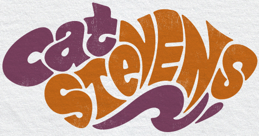
I worked on shirt graphics for Cat Stevens this past Thursday. The Fillmore poster style was noted as an aesthetic. I always find that I go about doing this Fillmore style in different ways each time it comes up. Sometimes it’s about only drawing the basic shape that the letter sits in, and adding interior lines to define the letter. This is the basic idea behind the popular Mojo font, and the fonts similar to it.
I’d prefer to not use an existing font, for a couple reasons. First, the font is recognizable, and looks less organic. Second, moving these fonts into the shape that you want is more trouble than what it’s worth. There’s been so many times I’ve been moving things around for an hour in Illustrator, when I realize I could have just sketched something original, and had it traced by now. Working in merch, with tight deadlines, I’ve learned to not waste time.
Instead, I simply sketched the letters on paper. This way, each letter could have it’s own identity. The drawback, is that sometimes you can just fail at this altogether. I think the key is to keep the pencil moving, and allowing lines to move through the whole piece. The top of a T could also line up with the middle of an E. Allow every letter to relate to the others.
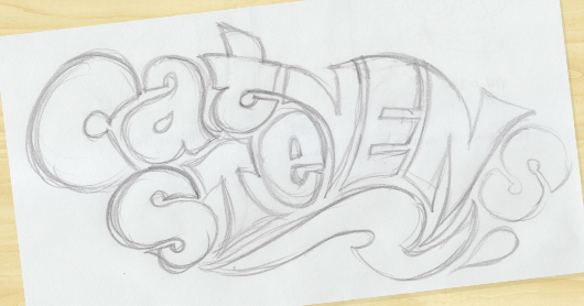
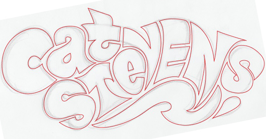
Next, scan it in. I use Image Capture for my scans now, as opposed to Photoshop plug-ins that I’ve used before. I take the image straight into Illustrator. I put the image, at a 40% opacity, on the top layer. I then use the Pen tool, with No Fill and a Red Stroke, and get to outlining the layers.
As many have probably learned, the key to the Pen tool is to limit the number of points. The more points you have, the more jagged your lines could be. The bezier can create beautiful curves, so let it do it’s thing. Keep re-doing each line until you get it right.
I purchased the Wacom Cintiq 12WX a few months ago, and I love it. This type of project is one of the many things it’s perfect for. Using a pen, as opposed to clicking a mouse, allows me to connect a little more with each shape. I may do a full review of the Cintiq later on.
So now I add a fill, and remove the stroke. I may use the Warp tool a bit, here and there, to fix tiny imperfections. Then I am left with my final vector.
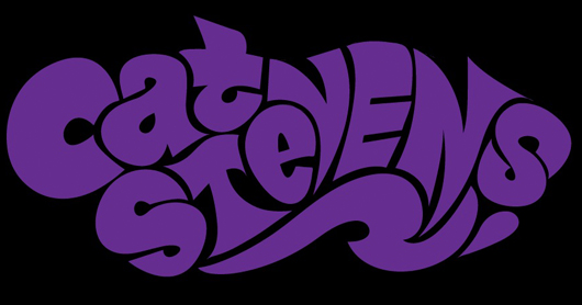
Now I bring the logo into Photoshop. After getting all of the lines and corners perfect, I’m going to smooth out all of the details I worked so hard on! I usually put the white logo on a black background, merge the layers, Gaussian Blur it, crank the contrast, select the white with the Magic Wand, and fill it again on a new later. This time, I split it into two colors. I usually try to keep the number of colors down, as the majority of my work is for shirt graphics, and each color costs someone more money. I add Layer Masks to the shapes, put a little texture in there, and that’s that.

The next time I do a graphic like this, I may do it differently. It’s neat for me to try different ways. I do think this was the quickest way that I’ve done this sort of thing so far.
Now, let’s just hope Cat Stevens Yusuf Islam likes it as well!
Please leave a comment, and I’ll reply quickly.


