The creation of the artwork and branding for Twenty One Pilots‘ sophomore album Blurryface was an in-depth, honest, and layered observation of the concepts behind the record, as well as an overall representation of the band, and how they are perceived.
Tyler Joseph, the singer and songwriter of the band, introduced me to the character over lunch. He explained the elements of ourselves that we hate, and the constant battle against these traits. In order to add clarity to this internal struggle, he gave a name to these negative attributes: “Blurryface”. This way, we can attempt to define the struggle, and to see the battle we are actually facing.
But Blurryface isn’t that black and white. There are more layers to him than described. He can either be represented as sad, angry, evil, or deceptive. He has a tendency to draw you in, but only to pull you down. Tyler mentioned a vision of his mutilated face, and all of the dread associated with the elusive enemy. There is something vague about him, and something that cannot be completely described. No matter what your interpretation of Blurryface is, it’s safe to say that he remains something that we try to hide, and not show to the outside world.
With the introduction of Blurryface, comes the prominence of the color red. In our quest to understand and define Blurryface more, we soon realized that the band’s previously used blue color had no place in this new narrative. The story is black and white, but with red. Red, the color of passion, violence, and anger.
The genre of Twenty One Pilots is famously up for interpretation. With every attempt at labeling the duo, the classification of Schizophrenic Pop is the only label that made sense. While critics may attempt to use this idea of an undefined genre against the band, Twenty One Pilots have clearly embraced their tendency to provide their listeners with stark dynamics both within the songs themselves, and across the album as a whole. The album takes you on a journey, giving you one new experience after another throughout all fourteen carefully-crafted songs.
After getting involved with the band’s merchandise graphics just after the release of their previous album, Vessel, I had the opportunity to dig into the various facets of everything Twenty One Pilots. What stood out to me more than anything was the dedication of their fan base. Affectionately labeled the “Skeleton Clique” the fans of Twenty One Pilots dig into every element of this group, and leave no stone unturned. They proudly proclaim their love for the band, and find meaning into every lyric and visual that the band presents.
With all of the information that I had gathered, I held onto three key elements that would help me brand the Blurryface album cycle; First, find a way to represent Blurryface in a obscure but potent manner. Second, create visuals that resemble the songs, as well as the mish-mash of the collection as a whole. And finally, reward the fans for their support of the band, and give them new journeys of discovery as they dig deep into all of the elements of this album.
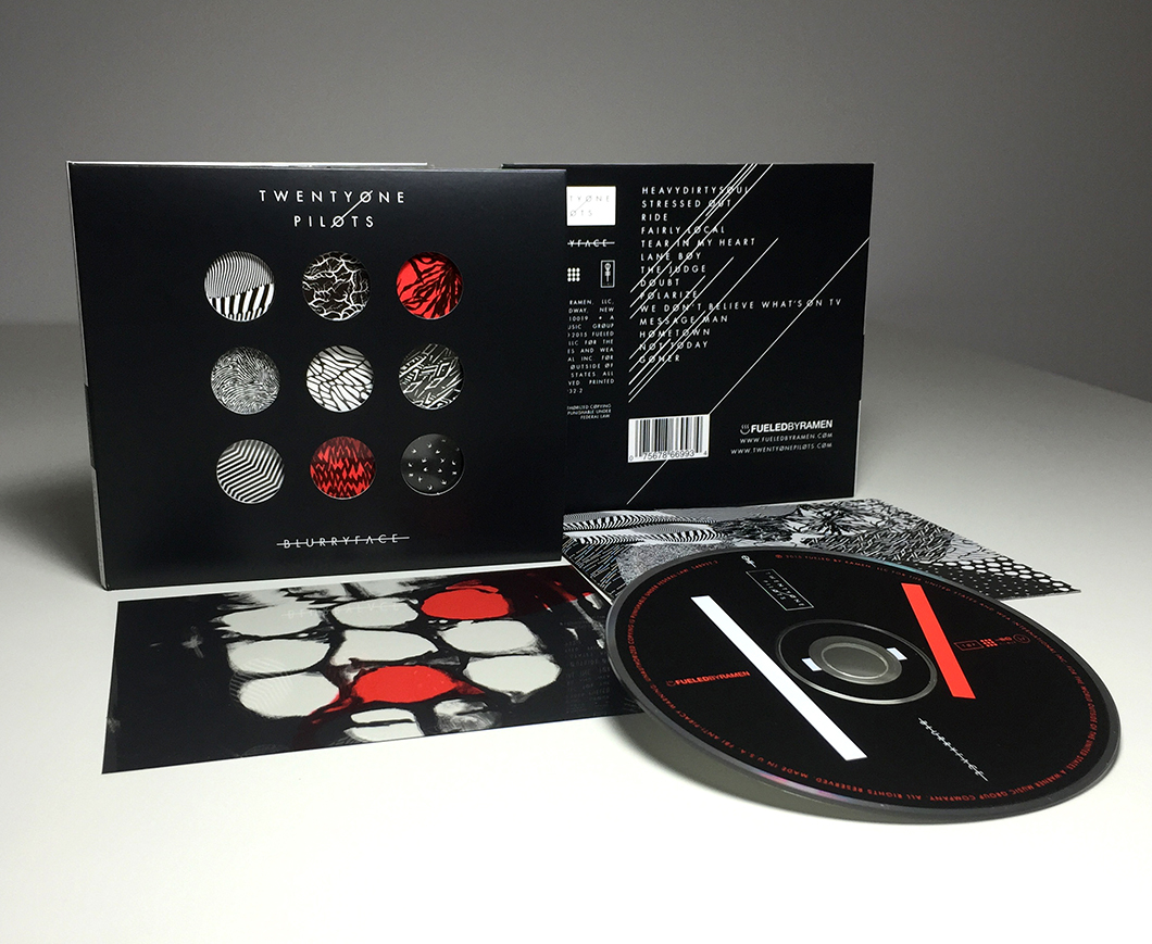
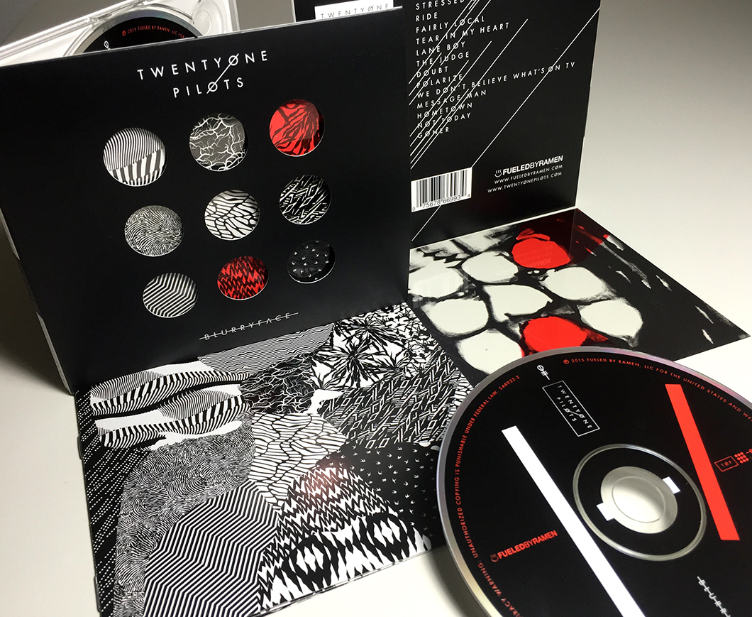
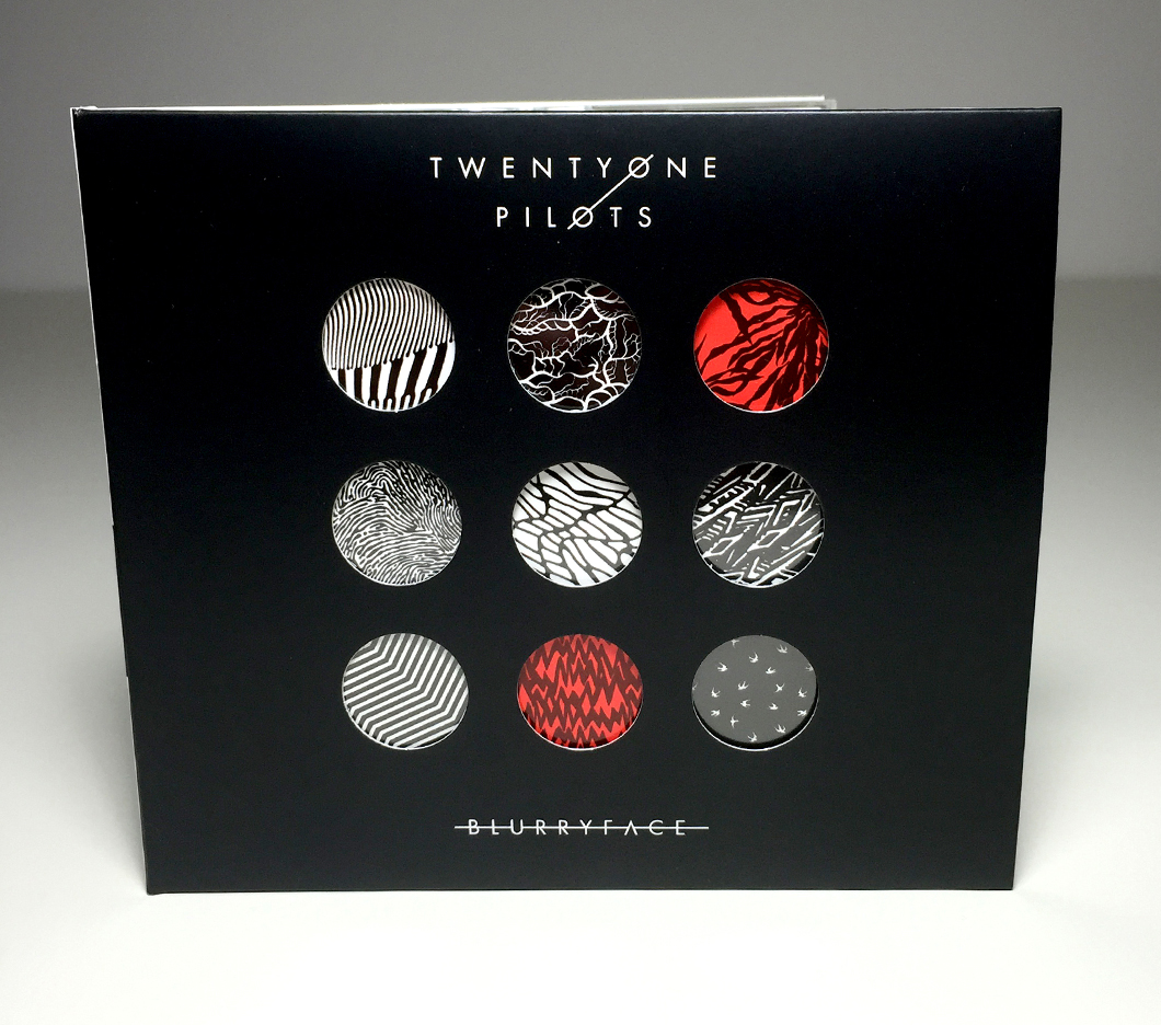
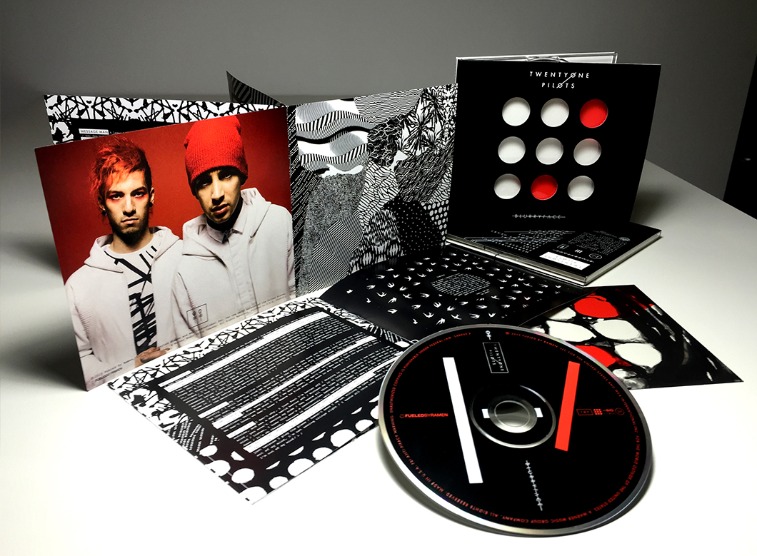
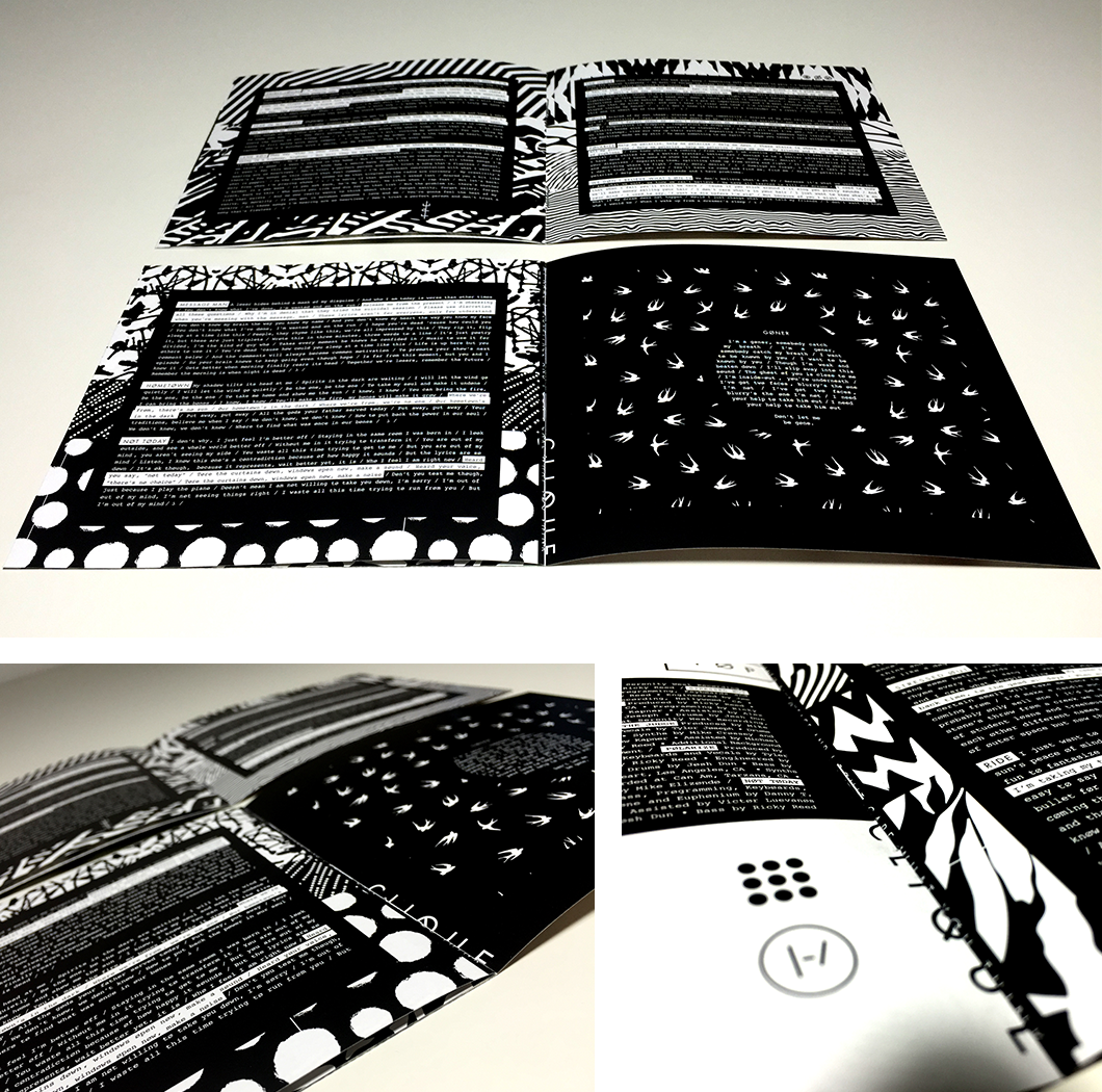
So the ideas came. Early on, I began an obsession with the idea of a collection of patterns. From a merchandise standpoint, the patterns would lend themselves well to a usable element on garments, so I wanted to be proactive about each element — thinking ahead on how versatile each visual would be for other applications. In addition, patterns have a way of conveying an overall vibe or emotion. I began a deep search into compiling patterns that would accurately convey the feeling of each song. I soon decided that black and white patterns would be much more portable than colored patterns. If the patterns stayed colorless, the red would be able to bleed in when appropriate. The other thing that I liked best about the patterns was that, in addition to representing the feeling of each song, the collection of all fourteen of the patterns would visually represent the diversity of the album as a whole. If one pattern represents one song, then the whole collection would then represent the complete album. I referred to this as the “tapestry,” where all of the patterns were seemingly haphazardly thrown together, which, in it’s very nature, was quite representative of the band.
Every decision consistently had a meaning behind it. Even when I attempted to throw things together, there was still a method. There are so many layers to this band, from the lyrics, to the genre complications, to the personalities of the two members. It was only fitting that the branding also contain multiple layers.
Now, before I dig even deeper into artwork, I’d like to describe my own intentions behind this artwork. I have made my career as a graphic artist in the music industry. The majority of my work is creating graphics for artist’s merchandise, a branch of the music business that has become one of the main revenue streams for the artist. What once seemed somewhat insignificant has made it’s debut into the limelight of how an artist is represented. While the artist gives you the experience of the performance, I get to create the tangible good that you walk away from the experience with. The t-shirt.
I take great pride in designing merchandise graphics. While it may rest low on the totem pole of sophisticated job titles, being a graphic tee artist allows me the privilege of constantly being interested in the artist, how they want to be perceived, and how their public perceives them. Over time, the task becomes fascinating.
So, when asked to create the branding and album artwork for Twenty One Pilot’s album Blurryface, I knew that my approach to the task would be too intense to make logical sense out of. See, I care so much about every little experience of this artwork. This in-depth approach rarely makes economical sense in the fast-paced music industry. The goal is to do something quick, and get it out the door. My goal, at least for this special album, was to create something with multiple layers of meaning as a love letter to such a dedicated fan base.

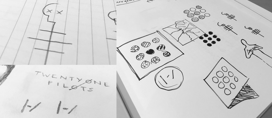
The first step in rewarding the dedicated fan base was to sacrifice the established bars symbol for the simple symbol that fans often included in their social media profiles and comments. Instead of a solidified logo, I thought that we should give the fans their logo. A typed bar, a hyphen, and a slash. Introducing the new Twenty One Pilots symbol: |-/ . This way, the fans have the ability to create their favorite band’s logo correctly, and spread the word throughout their online lives. A simple ode to a dedicated fanbase.
![]()
The next step was to establish a new logotype that was a little more representative of the tone of the record. The previous thick logo was traded for an all caps, thin type, that also incorporated crossed letter O, another theme established on social media.
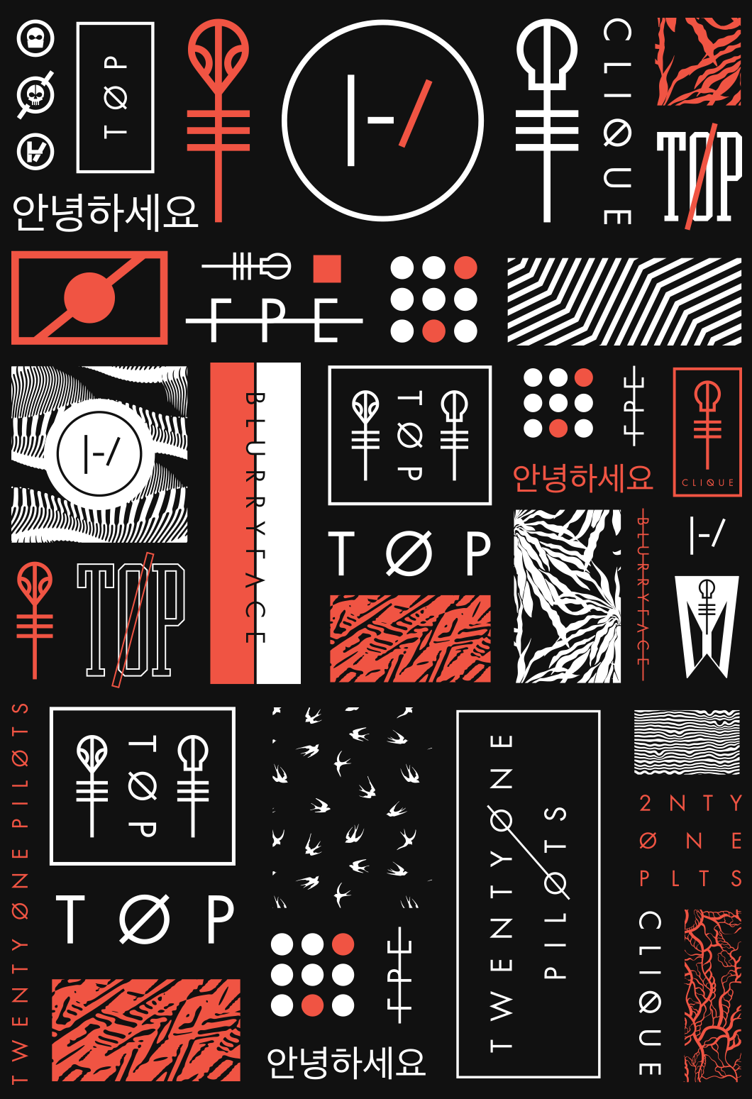
One of the unique aspects of creating the branding for the sophomore record is the opportunity to have a response to the tendencies of the band’s following. The new record was a progression from the previous, so I wanted to implement familiar elements that would help the fans come along to this new chapter of the band. So, in addition to a new logotype and a new symbol, I created a new icon set including marks for Skeleton Clique, Alien Josh, nine dots, Few Proud Emotional, as well as a logotype for the album title.
Tyler showed me nine dots, and his idea for making the nine dots resemble the bars logo. The idea, simple in nature, seemed to be iconic enough for the album cover. Add in the patterns, and the narrative behind them, and something began taking shape. Incorporating the Blurryface character as another “layer” both figuratively and literally, was perhaps my favorite finishing touch. I especially like the idea that you can “take him out.”
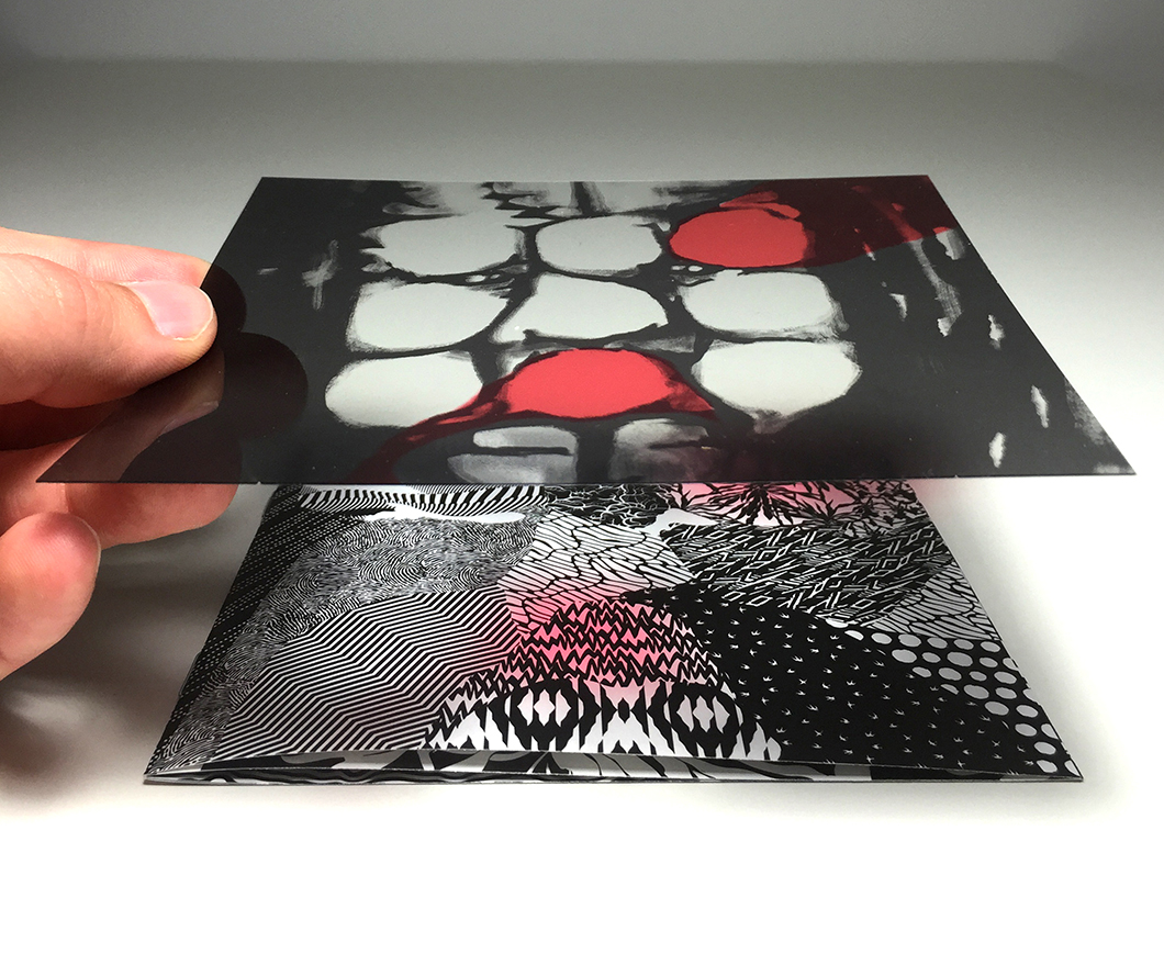
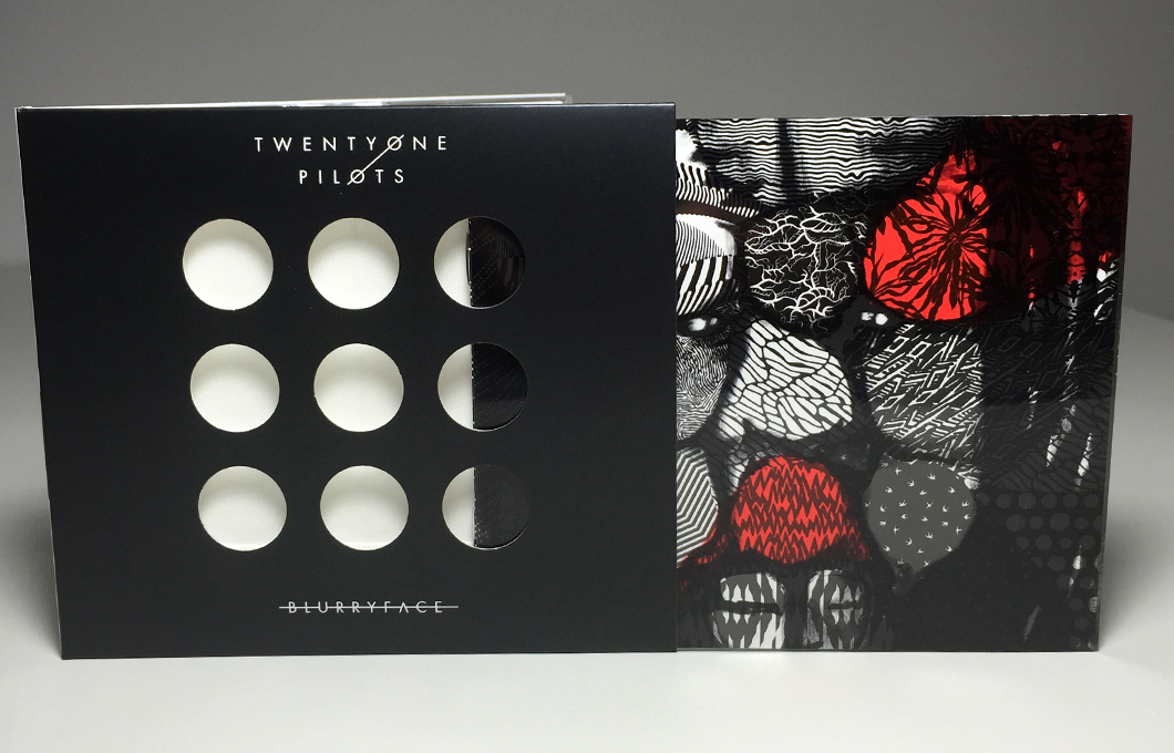
So when it comes to the story of the cover, I prefer to tell it in the reverse order that the package is opened. We are a culmination of contrasting traits, represented by the tapestry on the cover of the booklet. Our Blurryface often interferes with those traits, and alters how they are presented — represented by the transparent Blurryface image that covers the booklet. But we manage to package the mess inside, so that we can present ourselves to the world with something that appears put-together, under control, and with no visible imperfections — which is all encapsulated into the nine holes that button-up the otherwise haphazard contents. You may buy the album in the store that looks seemingly simple, but as you explore it, you soon find out how conflicted and complicated it all is. Much like how we all tend to present ourselves to the outside world, only allowing those close to us to see behind the layers.
If it weren’t for a rabid, obsessive fan base, all of this detail would be in vain. The fans gave me a reason to dig deep into the songs and their meanings. They gave me a reason to have deeper conversations with Tyler, to find out what really makes him tick. Graphic Tees come and go, but to dictate the feeling of an entire album cycle, and a chapter in the lives of both the band and their following – this was an opportunity that I didn’t take lightly, and didn’t want to squander.
Dedication deserves to be rewarded. In every element of Blurryface, we are opening a door for the fans to come in and discover more than what’s on the surface. Since long before I came onboard, the band preached the idea of “discovery.” This was an idea that stayed a prominent driving force behind every decision. So, as a reward to the Skeleton Clique – I proudly present the artwork for Blurryface.
Dig in, establish theories, find meaning, and continue discovering the many facets of this band. This is your band, and this is your artwork.
|-/
Pick up your copy of Blurryface.
-Brandon Rike