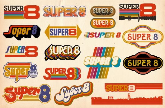
I posted a shot of this on Dribbble yesterday, and have received some great feedback. It’s for a small project, for a 70s-style raglan/baseball tee. Feel free to hop over to Dribbble to join the discussion.
I find myself with Illustrator artboards like this quite frequently. It’s a funny process. Basically, I’m trying to capture that perfect vibe for a logotype, and keep failing. I do one, think that it’s okay, but try another. I think that’s just okay, then do another, and another, and so on. Before long, I’m looking at a screen full of logotypes that have all nearly captured the vibe of what I wanted. Some may have even captured the exact vibe I was hoping for. Of course, that’s not discovered until I walk away from my desk for a while, and come back and look at them all with new eyes.
This is probably my single favorite thing about what I do. The times when I sit and tinker with letters, finely tuning things, until I see what I was hoping for. It’s much like practicing your signature on a piece of paper, you keep writing it over and over until you find one you like. Anyway, thought this could be an interesting post. Thanks for reading!


