Notebook

My Credo

I’ve been lucky enough to do what I love for a living. I’m hard at work because I’m busy doing the thing I love to do the most – be creative and make things. Over time, there are moments when my favorite thing to do starts looking a little bit like tedious work, and it’s up to me to step back and re-evaluate what I’m are doing, if we’re passionate about it, and what steps I can take to ensure that I stay passionate.

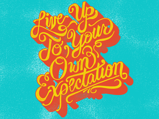
The last month or so has been one of those moments. In a way, it feels like a rebirth. Being passionate about what I’m doing has now become thee priority in my work. I’m reading books about staying passionate, and about working better and more efficiently, so that I can concentrate on doing what I love. Ever since the first time I was asked “What do you want to be when you grow up?” and I answered “..an artist,” I have been determined to make sure that hope became a reality. Not only did I want to be an artist, I wanted to be someone who was excited about their life, and excited about their work. Then I boiled my life’s goal down to one simple sentence; Live Up To Your Own Expectation.

I intended on living out that simple statement.

Thanks to Anne at Six Word Story Every Day for the post.
Color Titles

My buddy Jeff Finley asked me to contribute some titles for this WMC Fest video by filmmaker Aaron Freeder. I accepted the request as “make letters look cool,” which is basically all I really want to do in life. So, naturally, I obliged. As I tend to do, I overdid it. I got on a roll, and before I knew it, I had made 25 titles.

I mentioned I would post all of these titles on my blog, and I’m a man of my word. So, here’s the goods. Hope you like them as much as I did making them. You can also check out the Go Media post about the video and titles.

WMC Video Recap


WMC 2011 was a huge success, and I cannot wait to get back next year. Click the image above to watch a recap video, which I contributed many of the title graphics for.

Awesomefest 2011

Here’s my contribution to the Star Wars Themed Awesomefest 2011.

AwesomeFest 2011

Typography Samples

Typography Samples
A while back, I was using Cargo Collective as my main portfolio site, until I launched this website. I figured, at this point, having the two was quite redundant. I had the idea of taking different logotypes that I had created for use in other pieces, and strip them down to just the type, to finally showcase the type by itself. So, I’m trying out this new idea, to use my Cargo site for my typography samples. I do plan on adding quite a bit more soon, this is sort of a test run.  Check it out, let me know what you think. Visit the typography samples.

Jeni’s Splendid Ice Creams

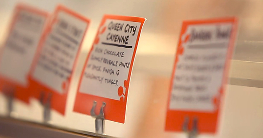
One of the many reasons I love living in Columbus, Ohio is Jeni’s Splendid Ice Creams. Once or twice a week, my wife and I will indulge. This is a required stop for anyone passing through. Check out this little video. Or just click the image below.

New Work

Just posted a big batch of new work. Take a look around. Here are a few of my faves…


Photo Explosion

#-Dimension
Lately, I’ve been freaking out on Instagram. I’ve just realized how neat of a tool it is to collect all the rad stuff I see throughout my day, like that little wonderful 3-Dimension thingy up there. This stuff kills me, much like the legendary Draplin. While Instagram is iPhone only, it also posts these photos to my Flickr page. So, one way or the other, feel free to follow along, and see some of the stuff I’m seeing from time to time.

The One-Trick-Pony Steals The Show

I think it’s important for us as designers to be a bit insecure about our work from time to time. It pushes us to improve and to push our boundaries. There is a difference between sulking or whining about not being good enough, and what I’m referring to – which is the statement “Dang, they’re better than me. I must get better!”

I deal with this from time to time, for different reasons. I’m a true lover of graphic design, and I have a physical reaction in my chest when I see a piece that is just done right. Good design hits you, and I want my work to be able to hit people the way good design hits me. Continue reading 

Stay Creative

Stay Creative
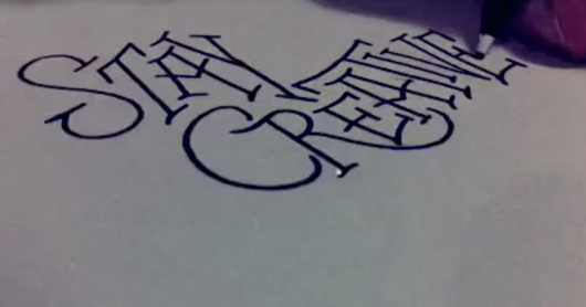
I’ve been finding myself using hand-lettering as a way to relax throughout a very stressful season in design. Everyone needs their stuff yesterday, and I’m doing everything I can to accommodate. Much like a smoker takes a smoke break – I find myself taking a break to just write a word or two down. Is that weird?

Anyway, I had an idea to record myself doing some lettering. It’s even neat for me to watch it back. Click the image above to watch the video.

…and here is another one.
Don't Talk About It...

Twitter

  • Categories

  • Recent Posts

  •